Wk6 – Spray Paint

I very much enjoyed this activity. Upon coming back from my San Fran trip, i made a quick run to Walmart for spray paint. I wanted some neutral cute colors. I decided to pick out blue and yellow because blue is a calm color but that yellow adds a dash of happiness – sunshine. In all, the color scheme reminded me of my trip full of blue skies and slight sunshine.  I used a cardboard from Amazon. My aim wasn’t as bad as I thought. Working on this reminded me of a video of a guy spray painting a galaxy. The only disappointment I had was the fact that the colors didn’t blend. I was hoping to create green.

Wk B6 – SOA Artist – Asia Roberge

Artist: Asia Roberge

Exhibition: lifting the viel

Media: Oil on wood panel and canvas, mixed media on vellum and paper, pencil on paper, cotton rope, yarn, and stick

Gallery: CSULB School of Art, Max L Gatov Gallery East

Website: n/a

Instagram: @asiarow


Asia Roberge is a CSULB senior studying in the College of the Arts. The program she is in is drawing and painting. She likes doing art that empowers women. Her plans after CSULB are to move to the bay area and build her work. She has thought about getting her masters a few years after graduation.

She has nine pieces of work. They are called: Looking down, caretaker, diva, after supper, green eyes, outgrowth, calendar girls, after supper, morning reflection and the sacrifice. Most of her paintings feature a women. She has oil on wood panel and canvas, mixed media on vellum and paper, pencil on paper, and a sculpture: cotton rope, yarn, and stick.

Her work is about women. She has painted women’s bodies for three years. She advocates for breastfeeding, women’s health and sexuality. She said that she uses red because it is about sexuality, visceral and carnal.

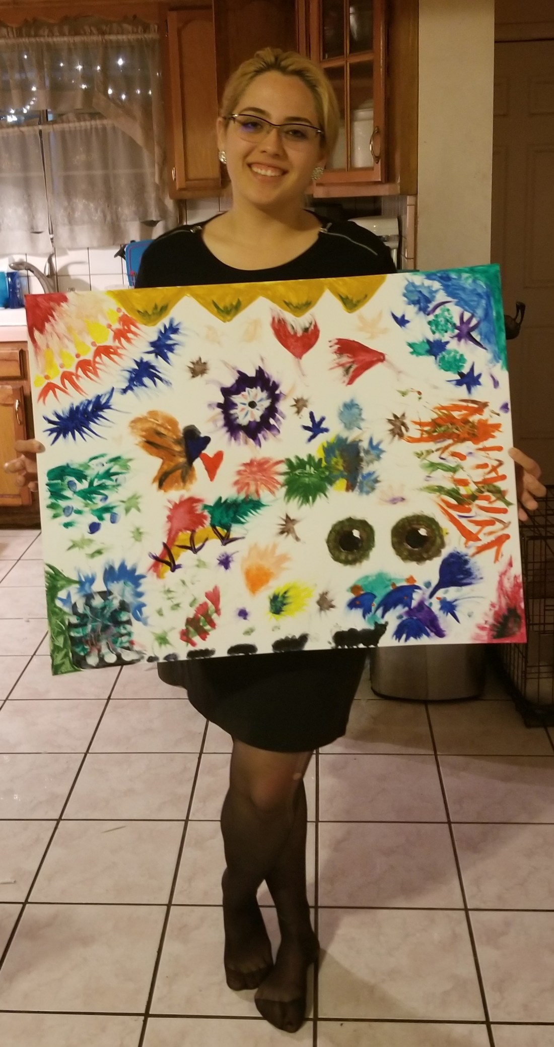
These pieces make me feel empowered as a woman. It is nice to see women portrayed in their own comfortable skin. The calendar girls piece is the one that closely represents how sexualized women are but the rest display a more natural self. My favorite is Diva because I like the texture, mixed media on paper.


Wk B5 – SOA Artist – Erika Barrios

Artist: Erika Barrios

Exhibition: MFA Advancement

Media: Sculpture

Gallery: CSULB School of Art, Max L Gatov Gallery East

Website: n/a

Instagram: @___e_n_b___


Erika Barrios is an graduate student at CSULB. The program she is studying is sculpture. She is in her 2nd year. Her undergraduate degree is in gender and women’s studies from UC Berkley. The themes she tries to achieve in her work is identity, gender, sexuality, embodiment and feminism. She hopes to have her work exhibited in LA. She is also thinking of being a preparator or cureator.

She has three pieces of work. They are called: Familia(r/l) embrace III, not in this dimension, viscera. Familia(r/l) embrace III is cotton shibari rope, latex paint on size 50 circular knitting needles and cochineal dye bath. Not in this dimension is linen cloth and thread, burned leather, yak down and wool yarn dyed with cochineal, onion skins and coffee grounds, brass nails, acrylic ink on buckles and d-rings, and stained reclaimed wood. Lastly, viscera has rayon/wool yarn, burned leather dyed with cochineal, copper wire, acrylic ink on buckles and d-rings, linen thread, and jute fabric.

When I saw her work, I thought the abstract work came from the idea of the female reproductive system. The shape reminded me of the uterus and fallopian tubes. When interviewing the artist, we were not that off. The idea actually came from a dildo harness. Concluding that her work stemmed from sex toys and acts, I asked if her black art work represented bondage and she said it did.

These pieces really made me think of the progress women have had regarding expressing their sexuality. In the old days, women were shamed about speaking about certain sexual acts. Seeing as how this artist is making art from sex acts and BDSM makes me feel that women have come a long way from showing their sexual expression.


Week B4 – Architecture & Urban Planning

This week we were given the task to redesign the USU wedge. The wedge is a problem in the sense that there is not enough space for the ongoing traffic. I changed 3 existing pieces. As you can see in the picture below, there is almost no room to walk by.

Before.png

The benches, items A & B were moved closer to center. The main concern bench was item A but to maintain parallelism, both benches were moved. The column, item C, was moved further from the edge. These changes were to maintain the design and allow more walkway space. The picture below shows my sketch with the changes modified.

After.jpg

This is better because it still has the essence of the design but allows a smoother flow. Trade offs are minimum. If anything the benches are not as close to the edges, which under the current time, the columns could’ve provided shade. I think students will not see a difference. Its ample enough to be safer but discrete to notice a change.


Week B3 – Landscapes with a Corpse

This week we had to do a landscape with a corpse picture. The idea of thinking how we die is morbid and very dark. I thought about going in a heart attack type of way. My props include my laptop, homework, to-do lists, 4 shot espresso caramel machiatto, and a vodka bottle. As an engineering student it is very hard to balance your social, work, school, and family life.

I think the picture did not capture the stress essence too well. The main focus is not all the work on the table. If I were to do this activity again, I would pose in a at the bottom of a tree because I climb trees and get bruised while doing it. It would be more probable falling off, hitting my head and dying that way.

IMG_5023

Wk B3 – SOA Artist – Christian Franzen

Artist: Christian Franzen

Exhibition: From Here: A Group Show

Media: Oil on Canvas, 56″ x 60″ and 17″ x 16″

Gallery: CSULB School of Art, Marilyn Werby Gallery

Website: bechance.net/christianfranvan

Instagram: n/a


Christian Franzen is an undergraduate student at CSULB. The program he is studying is drawing and painting. He is in his final semester He plans on going to grad school ideally in the east coast to specialize in art painting or visual arts.

His pieces of work are two abstract paintings. They are Oil on Canvas, 56″ x 60″ and 17″ x 16″. The bigger painting is named House. The color scheme is mainly dark. There are a lot of shades of blue and green. The colors that stand out are yellow and orange. The drawing has an essence of 3D work because there are many geometric shapes. The smaller painting has less colors. It is more calming. The title is called Bradford. It has a distinct yellow pattern.

The artist likes using the color blue. He did not have a reference or idea to initiate the painting. He likes using blue and green because he feels it allows depth. There is a lot of illumination with those colors. It reminds him of deep space and the ocean.

The purpose of this project was to represent abstract work. Abstract work us allows us to express ourselves without precisely having a purpose or a reference. I liked these paintings because of the color.

Week B2 – Finger Painting

I did the paintings twice because I thought I did the first one wrong. The first one I did coming home from work and with my brother. It was an attempt to do something together. However, he worked on it and got bored quickly. I finished my painting alone while listening to my playlist. I say a lot of doodles came out of it and there were some intentional things. That piece is the picture in the bottom.

I realized this morning that my art wasn’t abstract enough since there was still some parts that had figures. During my next art piece I had an audience, my brother and mom. It definitely influenced the colors I chose. They kept on trying to interpret my paint at every state. That was frustrating and I wanted to prove them wrong. In general the second one was more enjoyable because I was less stingy with the paint and I felt less pressure to fill each empty space.

Finger painting was harder than I thought. I think I would need a lot of paint to create a fuller look. Painting without a subject was hard. I like having a reference or an idea. I felt liberated when I stopped using just one finger and just used my entire hand – the black part in the top painting. Overall I really liked it.

20180225_145857.jpg

Wk B2 – SOA Artist – Christian Nunez

Artist: Christian Nunez

Exhibition: Mi Gente

Media: Oil on Canvas, 14″x16″ & 18″x20″

Gallery: CSULB School of Art, Marilyn Werby Gallery

Website: N/A

Instagram: @chrissnnunez


Christian Nunez is an undergraduate student at CSULB. The program he is studying is drawing and painting. He is in his final semester and will be moving to Japan after graduation as an English Teacher. He has been studying Japanese for 4 years. He will continue painting and drawing.


His pieces of work are two paintings of an elderly man and woman. They are Oil on Canvas, 14″x16″ and 18″x20″. The portrait of the woman is her facing straight with a suave smile.  Her hair is pulled back, with a blue top, and a black scarf. The background is yellow which can represent life. She appears to be very old, about 80. The portrait of the man is more serious. However, the background is not only yellow but includes a traditional Mexican fabric in the back. The wall also has a pattern. The man is wearing a sombrero with a white top.


The purpose of this project was to show culture. The paintings are of Christian Nunez’s grandparents. He chose them to show his culture because that is how a typical elderly Mexican is portrayed. His family is from Jalisco, Mexico. He chose his grandparents because he has not seen them in a long time and wanted a form to bond with them. He likes painting elderly people because there is more depth and detail, as in all the wrinkles and fine lines. The grandma’s art piece took more work because he did a grid and drew with pencil first before painting. The grandpa’s painting was straight to paint.


This exhibit spoke to me because I am Mexican. I had also seen his artwork the previous week in the gallery called Afterlife. His paintings were relatable in the sense that we celebrate Dia de Los Muertos and we listen to Mariachi. One of his paintings from last week featured a man laying on the bed, perhaps overdosed, and the bottle was Jack Daniels. I asked him why he chose whisky and not a typical Mexican drink like Tequila. He said he thought that whisky was the adapted drink to second generation families.


Wk B1 – SOA Artist – Suzanne Mitchell

Artist: Suzanne Mitchell

Exhibition: Female Introspective

Media: Archival Inkjet Print, 24” x 32” and 20” x 30”

Gallery: CSULB School of Art, Max L. Gatov East Gallery

Website: FB – ImageBySuzanne

Instagram: @imagebysuzanne

Suzanne Mitchell is an undergraduate student at CSULB. The program she is studying is photography. She likes doing fashion photography. It is a field where women can show their confidence. She likes taking pictures of people of color because it diversifies the fashion industry.

Her pieces of work are two pictures of women of color. They are Archival Inject Prints, 24” x 32” and 20” x 30”. One portrait features an Asian American woman arching her back with her arm up above. The background color is blue. She is facing away the camera and you can see her long shiny black hair. The other portrait features an African American woman fiercely facing the camera with a pink background. Both images show confident women feeling comfortable and sexy. Mitchell allowed the models to come dressed in whatever they wanted. The background color scheme was shown in a way that was white centered and more colorful at the edges.

The purpose of this project was “Embracing and empowering the feminine expression” (Artists Pamphlet). Her models portrayed confidence, beauty and grace. Mitchell took the pictures in such a way that let the models pose as they wished. She wanted to ensure a comfortable environment so it was just her and the model. As mentioned earlier, the models were able to choose their own outfit. Mitchell captured their essence and strong inner force.

This exhibit spoke to me because after this summer I have begun to get more in touch with my feminine side. Back then I was more casual, comfort over fashion gal, but after losing weight, changing my wardrobe and attitude I have been able to be more confident. This art show showed women being proud of who they are and showed them glowing! It made me really proud.

Wk B1 – Art Experience – Plaster Casting

20180214_180033

This week’s task was to create a plaster casting of a body part. In honor of Valentine’s Day, I decided to shape my hands into a heart, or so I tried. As you can see in the image, it looks more like half a heart. It is still missing a piece. My friend, Daisy, and I went to Sunset Beach. She helped me throughout the process.

  1. Got my hands in the sand and had Daisy step on the wet sand to guarantee a mold.
  2. Tried really slowly to remove my hand without destroying the mold
  3. Now Daisy was got her hand in the sand and I was stepping on it. She removed her hand and we had two molds ready.
  4. We got water from the ocean to make the mix
  5. Mixed the water and plaster but we realized we put too much plaster and not enough water
  6. Ran back to get more water
  7. Mix, mix mix
  8. Daisy decides to put her hand in mixture to help blend but then I scared her on how dangerous it was so she went back to the water to wash off
  9. Continued mixing to a soother consistency and poured in both molds.
  10. Waited for about 15 minutes and dug out our art projects!
  11. Rushed back to campus to get Daisy to her next class 😀

In middle school, there were art exploratory classes but I was never able to take them because at first I was in English Language Development Class and then I moved to Performance Dance for the rest of the years there. In high school, there was also an art class but i couldn’t take it due to the fact that I was in the engineering program, Project Lead the Way. However I did take music class, so I was able to explore some form of art.

I am thankful that now I am able to take an art class. Hopefully I can take more classes, ones that explore more technique. I would like to learn how to draw better – with shading and such.