Week B8: Los Angeles Flag

I wanted my flag background design to be a bit more abstract. The start process was angling a road from the “back” right top corner to an “opening” left side. I wanted that to channel a rode that widens – a brighter future filled with opportunity. I kept the three colors separate because it looked more bold and neat. I chose that red because it symbolizes power, blue because it is calming and reminds me of the ocean, the inner one is actually a very light shade of blue and that is because I wanted to maintain an icy feel. I wrote the city name in black calligraphy pen style. The bottom right corner of the flag has a yellow vine design to represent how intricate our city is and the multiple paths life can take you when you “branch out”. Also, the road idea became more looking like triangles and I still liked that because triangles represent fairness.

The current flag to the left is called LA’s “Fiesta Flag”. All it screams to me is Taco Bell. I know that a large group of people are hispanic in LA and might be why the flag is themed that way. I don’t love it, I barley like it. I think the colors represent too much “Raza”. I think our new flag should incorporate  a more elegant and abstract design like my design. LA has a lot of art integrated in its city though murals, graffiti writing, and many others. It is also full of ever-growing beautiful skyscrapers. LA isn’t just about uniting to party – “fiesta”; it is also about gathering to display and appreciate our art.

*I designed the flag using my Note 8 S-Pen in the Samsung Notes App.

Wk6 – Spray Paint

I very much enjoyed this activity. Upon coming back from my San Fran trip, i made a quick run to Walmart for spray paint. I wanted some neutral cute colors. I decided to pick out blue and yellow because blue is a calm color but that yellow adds a dash of happiness – sunshine. In all, the color scheme reminded me of my trip full of blue skies and slight sunshine.  I used a cardboard from Amazon. My aim wasn’t as bad as I thought. Working on this reminded me of a video of a guy spray painting a galaxy. The only disappointment I had was the fact that the colors didn’t blend. I was hoping to create green.

Wk B1 – Art Experience – Plaster Casting

20180214_180033

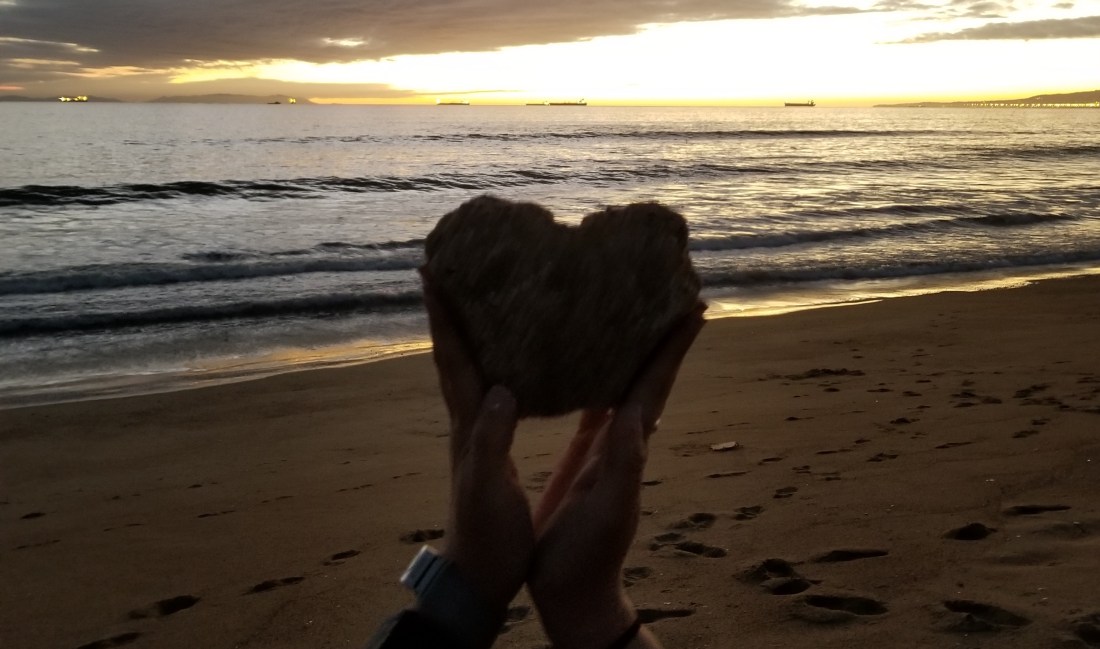
This week’s task was to create a plaster casting of a body part. In honor of Valentine’s Day, I decided to shape my hands into a heart, or so I tried. As you can see in the image, it looks more like half a heart. It is still missing a piece. My friend, Daisy, and I went to Sunset Beach. She helped me throughout the process.

  1. Got my hands in the sand and had Daisy step on the wet sand to guarantee a mold.
  2. Tried really slowly to remove my hand without destroying the mold
  3. Now Daisy was got her hand in the sand and I was stepping on it. She removed her hand and we had two molds ready.
  4. We got water from the ocean to make the mix
  5. Mixed the water and plaster but we realized we put too much plaster and not enough water
  6. Ran back to get more water
  7. Mix, mix mix
  8. Daisy decides to put her hand in mixture to help blend but then I scared her on how dangerous it was so she went back to the water to wash off
  9. Continued mixing to a soother consistency and poured in both molds.
  10. Waited for about 15 minutes and dug out our art projects!
  11. Rushed back to campus to get Daisy to her next class 😀

In middle school, there were art exploratory classes but I was never able to take them because at first I was in English Language Development Class and then I moved to Performance Dance for the rest of the years there. In high school, there was also an art class but i couldn’t take it due to the fact that I was in the engineering program, Project Lead the Way. However I did take music class, so I was able to explore some form of art.

I am thankful that now I am able to take an art class. Hopefully I can take more classes, ones that explore more technique. I would like to learn how to draw better – with shading and such.